How Color Rewrites Your Brand Story
On a recent call about refreshing headshots, one of the team members said,
I think the reason you made it black and white is to show consistency, right?
We were looking at a team photo I took of an all-women team of financial advisors at a major firm.
I smiled and said, “Actually… What you’re noticing isn’t the lack of color that gives the image consistency. It’s that the image is monochromatic.”
Monochromatic doesn’t mean black and white. It means pulling from a single color family and building a cohesive story with intentional contrast, texture, and tone.
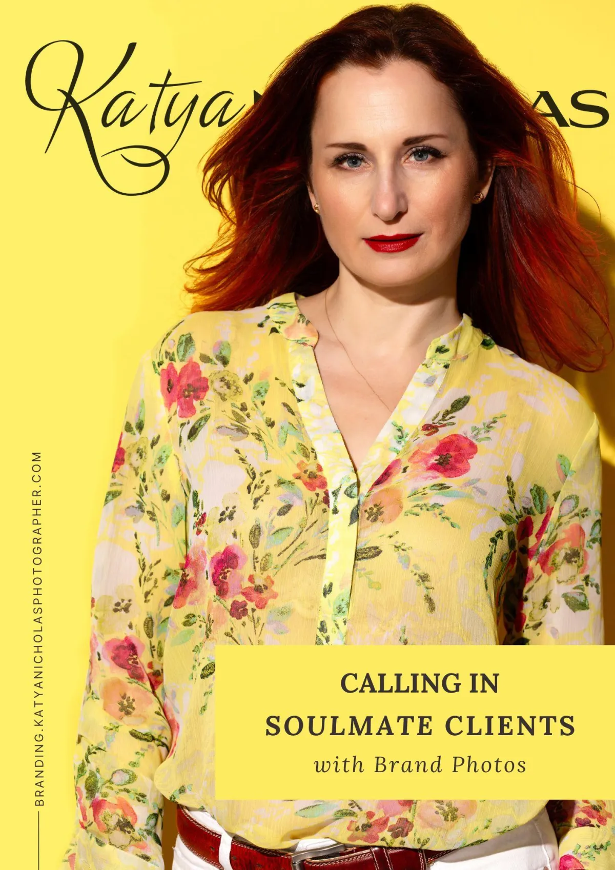
I loved that conversation and decided to create a few self-portraits to demonstrate the idea of staying monochromatic — but with color.
This is the first portrait.

Bright yellow background. Red lipstick. Red leather belt. White jeans. A top that brings all of it together. A little wind in the hair... [insert a hair flip emoji that, sadly, doesn’t exist]
It’s full color and it is elegant. Polished. Confident. Radiant.
I purposefully went for this sun-kissed effect with lighting to create the kind of glow that comes from knowing you don’t need to shrink or overstate — you just show up and brighten up the day.
When people think monochromatic, they often imagine minimalism — maybe neutrals, maybe black and white… definitely understated.
But monochrome doesn’t have to whisper.
It can pop. It can play. It can flirt a little.
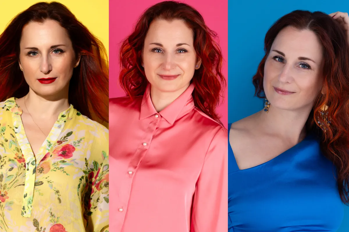
And this is what I did in this second self-portrait against a bright pink backdrop.

I pulled everything from the same tonal family:
A soft pink silk shirt
Black slacks with flowers in varying shades of pink
Black Oxfords trimmed in white pearls — echoing the pearl buttons on the blouse
And I made sure the facial expression meets the color: it’s bright, warm, and quietly delighted.
Everything in this image was chosen intentionally — not to “match,” but to create visual cohesion.
This monochromatic image isn’t whispering. It’s saying something playful, polished, and just a little bold.
After shades of pinks and flirtation with color, I wanted something with more contrast. More disobedience.
“Maybe I can do something with our cute dining chairs,” I thought, brainstorming further ideas for my color-study series.
As I gave this one a fresh look, my brain formed the image instantly: 𝗰𝗼𝗹𝗼𝗿 𝗯𝗹𝗼𝗰𝗸𝗶𝗻𝗴.

There are echoes of fuchsia and teal in the paisley design. These two colors happen to be my favorites.
And I happen to love a little color blocking.
Unlike monochromatic shades from the same family, color blocking emphasizes contrast and clarity.
Designers, artists, and photographers use it to:
Create visual structure and energy
Draw the eye to the subject (you)
Evoke confidence, clarity, and boldness
In personal branding, color blocking makes a statement.
It says: I know who I am. I know what I want to say.
In my case, this photo tells you a few things about me before I even say a word.
If I were to use this image in my branding, it wouldn’t be just about style.
It would be about energy:
Bold, but self-possessed
(Yes, I’ll wear fuchsia—and won’t shrink when someone says it’s “too much.”)Elegant, but disobedient
(I follow intuition, not dress codes—or unsolicited advice.)Feminine, but unsentimental
(Feelings? Yes, plenty. Emotional theater? Nah, thank you.)
Color blocking doesn’t apologize. It provokes—in the best way.
From bold colorplay to clean intentionality—this next portrait stripped everything down to pure elegance.
This white-on-white portrait also happens to be the centerpiece of my coaching brand’s visual reintroduction.

The message I wanted to send: professional, but not stuffy.
The image is minimalist, but it is not sterile.
And it is unmistakably feminine—on purpose.
One of my favorite quotes of all time has been, “Pretending to be a man is a waste of a woman.”
So I’ve always made it a point to underscore my femininity, not neutralize it.
That’s why there’s lace under the structured blazer, and a non-statement necklace that makes one—subtly.
And then there’s a wide fuchsia belt disobediently interrupting the white-on-white minimalism. Fuchsia is here because it serves as punctuation to signal that clarity doesn’t mean conformity (just because something is bold, it doesn’t mean it’s chaotic. Plus I needed to tie the image to my website’s accent color.)
Pro tip:
If you don’t know what to do with your hands in a photo—and you don’t have a human mirror (aka: a photographer whispering “drop your shoulder”)—grab a prop.
In my case it’s my iPhone, in fuchsia (of course). Full transparency: I’m holding it because it’s the remote I use to operate my camera for self-portraits. But it also helped create a more natural pose and reinforce what I want my brand to communicate: I’m in the business of conversing, connecting, listening.
My other favorite color is blue. I’ve lost count of how many shades of it I have in my closet—so of course, I had to create an image in this cerulean blue silk dress.

This self-portrait was not meant to be flirtatious.
And yet, here I am—flirting with the camera.
It’s in the body language.
You typically don’t fluff your hair in a professional photo, right?
But this does not disqualify the photo. There’s room for these “just because” portraits.
You don’t need a major milestone to have a personal photo taken.
You can have one to honor your womanhood (or humanhood, for that matter).
I remember asking someone years ago if she’d do a portrait session just for herself. She laughed and said, “What would I even do with those photos? Hang a huge print of myself in the living room? That’s… vain.”
Vain.
Such a loaded word with so many emotional layers and negative beliefs peeking through.
Yes, some of those noble folk centuries ago commissioned portraits out of vanity. But not all. Sometimes, they just wanted to be remembered.
Back in St. Petersburg, I’d spend hours at the Hermitage or other galleries, staring at those portraits.
I loved studying faces, especially when they were well-rendered—like in Rembrandt’s portraits — where every line in the face tells a story.
So why is it uncomfortable, in this century, to put a “just because” portrait of yourself on a wall?
The you in you — not your role (parent, boss, survivor, etc.)—deserves to be seen. And not temporarily as in “felt cute might delete”, but timelessly in a beauty portrait.
Beauty has many faces, and not all of them believe they’re beautiful… until they look at themselves with unconditional love.
What’s a beauty portrait?
I referenced this term just a few lines above, but outside of photographer circles, this is not a very well-known term. Or people typically think of beauty shots used commercially—to sell skincare, makeup, or perfume.
Those are typically made to look impeccable (read: airbrushed into porcelain dollhood) because—well—the “beauty” industry forgot that beauty means life: lines, scars, texture, tension or softness… your story.
I wonder if this is why, whenever I bring up the idea of a “beauty portrait” as a ‘just because’ photo, women start to feel uneasy.
Not because they want to look like a porcelain doll—but because that’s the image we’re shown again and again.. despite the efforts by some brands to show real women of all shapes, sizes, and skin tones.
A beauty portrait isn’t for someone like them–in their mind. It’s for the flawless, the unwrinkled, the airbrushed. So—without even realizing it—they assume, ‘I could never look like that.’ And so they quietly opt out… and say, “I don’t like my picture taken”.
But I won’t give up offering!

I took this self-portrait that I decided to include as the last one in this color-study series because I needed to test the backdrop and the lighting.
The image is not exactly monochromatic, but it is minimalistic on purpose. Its only job is to focus on the face—because that’s what a beauty portrait is for.
This isn’t for a campaign. It’s for me.
A way to allow myself to be seen. (And I became comfortable in front of the camera only in the past few years because I needed to know what it feels like when one is pointed at you.)
Pro tip:
The backdrop color is warm beige to bring warmth to the image and complement the skin tone. For darker skin tones, a darker beige or brown would work better.
And with this final frame, I'm closing the color study series.
Do you see now how much color adds to your Brand Story? It can shift perception and communicate who you are before you speak a single word.
If this series got you thinking about your own brand presence—how it looks, how it feels—you’ll love my free guide:

This resource will help you plan brand photography that aligns with your message, attracts your ideal clients, and feels like you.